UX Design Projects
Designing how vulnerable people and tourists navigate into unfamiliar locations with safety information.
My role: UI/UX Designer
Timeline: Mar 2024 - Apr 2024
Problem Statement
People often feel unsafe and insecure while travelling at specific locations at specific time especially in areas they travel for the first time.
But how can we help them take informed decisions about when and where to travel ?
User research
User interviews revealed that participants, especially those from vulnerable groups, expressed a heightened awareness of safety in unfamiliar environments.
While interested in using safety data, some users expressed concerns about sharing their own location data or personal experiences publicly.
User interviews
Users indicated a need for detailed information beyond just crime statistics, such as specific types of risks, time-based safety variations, and personal experiences shared by others.
Competitive Analysis
Competitive analysis helped us identify that there are no such tools or products that specifically offers safety or danger zone information.
Many users relied on word-of-mouth recommendations or outdated online resources, highlighting the need for real-time safety information.
Design intent
Our primary goal is to enhance awareness about unsafe areas, particularly for vulnerable groups such as women, transgender individuals, and children.
How ?
How might we provide an experience that even non tech savvy users could easily locate an unsafe area ?
How might we simplify the process of marking a location as unsafe and dangerous ?
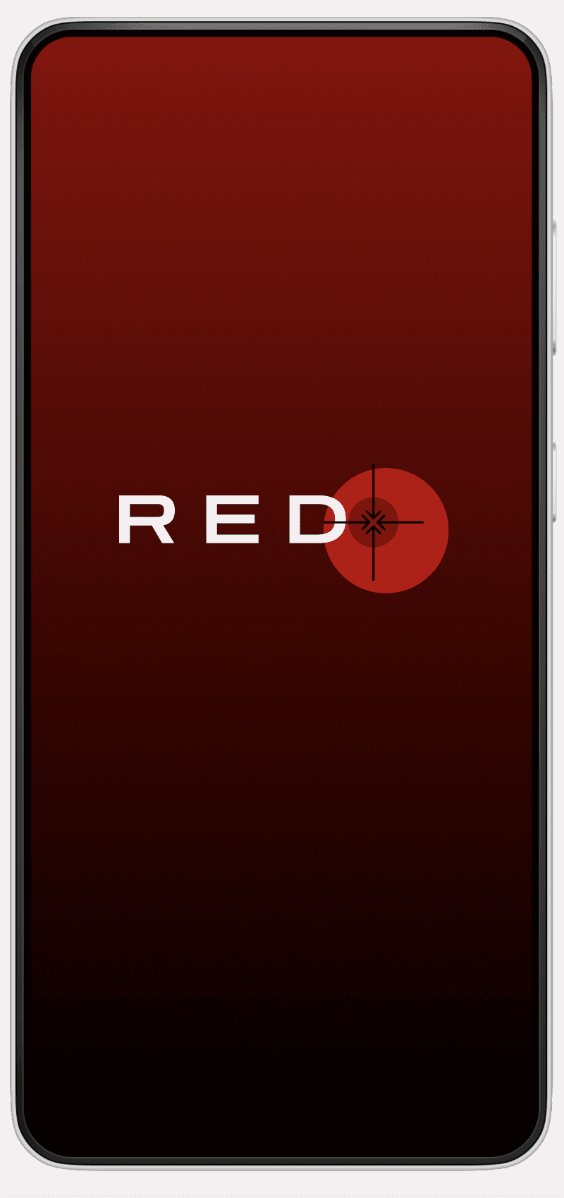
Red color denotes danger , target point denotes a specific location
rED
RED abbreviation Rescue Everyone in Danger
rED
Final Logo Design with font Zen Dots which is a sans serif font that coveys power and stability
Typography
T1 TITLE 32px
H1 HEADING 24px
H2 HEADING 20px
P1 Body text 16px
S1 Small text 12px
Colors
PRIMARY
#BB0000
#121212
SECONDARY
#121212
GRADIENT
#8C0000
#000000
NEUTRAL
#121212
Challenges
There were both technical and time constraints, some of which are mentioned below:
Incorporating map would be a major challenge as this is a non profit app there are budget constraints.
Credibility of the data has to maintained through constant moderation of users input.
Feedback & Iterations
Peer review revealed preference of quick and easy process on contrary to lengthy and tedious process.
Based on the feedback, questionnaire was made short and descriptive reply to questions were made optional.
Key features to be implemented
Some of the user-centric features designed are as follows :
Multi-layered Safety Reporting: The app allows users to report various safety concerns (e.g., harassment, lack of accessibility, poor lighting, lack of security) with options for detailed descriptions and anonymous reporting.
Time-based Safety Indicators: The map displays safety information with time-based overlays, allowing users to see variations in safety throughout the day.
Crowdsourced Data: The app collects and displays safety information contributed by users, enabling others to make informed decisions.
Key performance indicators
The app can contribute to creating safer environments for all individuals. Ongoing monitoring and optimization will ensure that the app continues to meet the needs of its users and contributes to its mission of making the world a safer place to live.
Learnings
Most important takeaways are
User generated data has to be moderated and validated through location tracking, time tracking to ensure the source of information is valid.


